When it comes to internet marketing, it is absolutely essential to have a website. It is through this website, people would get to know about the product and services which you have to offer, besides, it can also be used as a medium of communication with the people who visit your website.
While developing a website, the most crucial aspect that needs to be taken into consideration is the home page. It is the home page of your website that would create the first impression and invariably, the first impression is the last impression. Therefore it demands a lot of planning while designing the home page of a website.

Some Tips to Build an Attractive and Enticing Home Page
Designing a webpage is not a difficult task. You can get a website designed by the developers; however, you need to consider how far it will serve your purpose. When it comes to web design these days, it is done keeping in mind the marketing perspective. Therefore, a website needs to be designed strategically.
As mentioned, the most important section of your website is the homepage. Here are a couple of tips which would help you create an attractive and effective home page.
Keep the Design Fresh, Unique and Simple: The home page is the first section of your website your potential buyer would come across. Therefore make sure that your homepage contains answers to all the queries which people would have in their mind about your product or services. Try and avoid complexities and keep the design simple. However, at the same time, some amount of creativity needs to be put in to make it unique. Make sure that the home page is not overloaded with unnecessary and irrelevant stuff; instead, it should be precise and must portray a true and clear picture of your business.

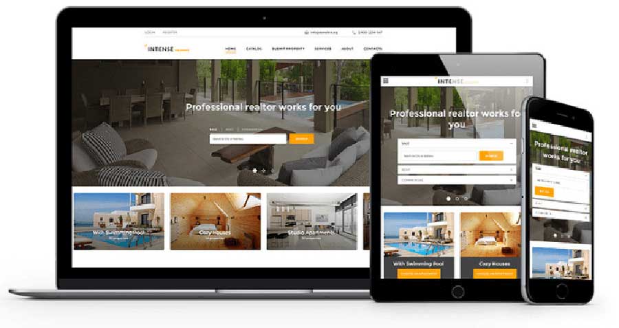
Supports different Gadgets: These days, people do not only rely on their desktop or laptop to surf the internet. With the advent of smartphones, they carry the internet in their pocket. Therefore, make sure that your home page can be accessed from mobile phones and tablets.

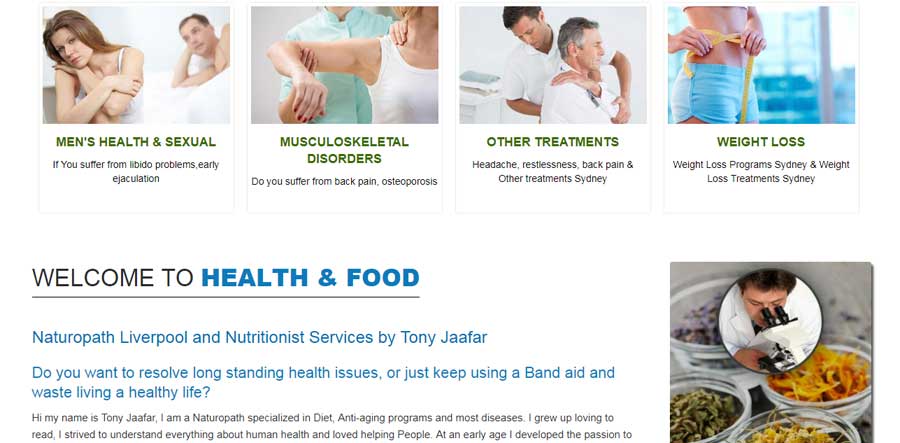
Your Product and Service needs to be showcased: This is perhaps the most important part which needs to be taken into consideration while designing your home page. People visiting your website should get a clear idea as to what you have to offer to them right away. Make sure that you have listed all the products and services on the home page itself to allow your would-be customers to get a clear picture of your offerings. It is also very important to add some relevant details pertaining to your company’s policies and vision.

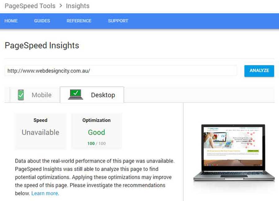
Site Load Times: It is absolutely imperative for you to ensure that the load time for your home page is as minimal as possible. People are impatient and they are not going to wait for your page to load; instead, they would shift to some other option available. Therefore, in order to get people engaged right away, it is absolutely essential to run a regular audit of your website and making sure that load time, site speed and the overall performance is at an optimum level.

Easy Accessibility: You need to make sure that the home page has an easy accessibility. For instance, not everyone has a high-speed internet connection. For them, you need to ensure that your home page loads as easily and smoothly as it would do for the other users.

Proper Page Organisation: This is another important aspect that needs to be taken into consideration. Remember that when someone is visiting your site, it some specific information he is looking for. Very rarely they would take the trouble of going through the entire page and read it. Therefore, make sure that your home page is designed in such a manner so that all the required and relevant information are presented in a well-structured and organized manner.

Accurate and Meaningful Content: More than anything else, it is the content of your home page that would create interest in your prospective customers. Therefore, the content needs to be organized and designed very carefully. It has to be presented in such a manner so that it offers accurate and precise information to the visitors. It is through your content; you would be able to convince your visitors about your authenticity and reliability.

These are some of the most common points which web designers keep in their mind while designing a website home page. Apart from these, there are various other technicalities which need to be taken care of when it comes to web design. However, these are some of the basic things which you cannot afford to ignore and must make sure that they are in place.
With the holiday season coming, eCommerce stores are aiming to hit their target sales and achieve maximum growth. This is the only time of the year when people open up naturally and spend more money on the best bargains and deals they come across.
In 2018, holiday shopping through eCommerce sites is likely to grow by 15.3 percent compared to 2017. No doubt, online sales are growing each year. In 2017, eCommerce sales earned reported record-breaking $46.5 billion revenue for the period of November & December.

One of the biggest reasons for retailers to start preparing for the holiday season now is that the season is only growing lengthier over time. According to AdRoll report, 40 percent of consumers start their holiday season gift hunting in October, which is a whopping figure.
Moreover, it is crucial for retailers to prepare not only for the hectic holiday season but also for events like Cyber Monday and Black Friday – shopping events.
Before you start preparing, here’s a list of the upcoming holidays to note:
• Thanksgiving on November 27
• Black Friday on November 28
• Cyber Monday on December 1
• Green Monday on December 9
• Hanukkah on December 16
• Super Saturday on December 22
• Christmas Eve on December 24
• Christmas Day on December 25
• New Year’s Eve on December 31
Thanksgiving is expected to be a bigger shopping event than Black Friday.
In 2012, however, Black Friday sales surpassed the 1 billion dollar mark for the first time in the history.
Cyber Monday desktop online spending reached $1.735.
According to the Financial Times, Christmas Day is the big day for online shopping.
Prepare for the Big Days Ahead
#1: Have a Creative Plan

A good strategy is the basis of a successful initiative. In the case of eCommerce online shopping, the strategy is to craft a smart promotional campaign. Think beyond deals and offerings; create an attractive and memorable idea.
What is that element to take your holiday campaign to another level? The idea is to build expectations, make the idea/campaign shareable and create urgency in the minds of potential customers. You can begin by building expectations, announcing the future promotions much ahead of time, and sending emails.
You can start promoting with a tagline that reads 50% Off Holiday Season Sale Starts in 5 Days, and then countdown every day before the event. Do not forget to feature different products highlighting special prices.
In addition, the holiday season is the right time to launch limited edition products. Such products are attractive to shoppers looking for rare and one-of-its-kind of gifts.
#2: Create Customer Segments for a Tailored Approach

Not all customers are the same. While some may purchase only during sales, others might be frequent buyers. Then there are some high spenders, whereas another segment could be those who want to avail of free shipping. You have to segment your customers to motivate them to purchase. By targeting and segmenting your customers, you can tailor your offers to the right kind of audience.
You can take a small step by rewarding high spenders with some special discounts. Everyone loves to be rewarded, especially during the festival time.
#3: Create Email Templates

Email templates should be ready and handy before the final promotion rolls out. Even if you are unsure about the promotional campaign, setting up a template is always recommended.
People receive many emails during the holiday season that it is crucial to ensure your designs stand out. Think of your target audience, font size, and type, colors etc. Here’s an example:
Email marketing reaches everywhere. According to Custora reports, 25% Black Friday sales come from email marketing, which makes it a driving force. Likewise, an online retailer started an email marketing campaign that saw 330% growth in revenue per email sent.
As more than 61% holiday shoppers start searching online for purchases before the Thanksgiving weekend, according to AdWords report, it is best to start early.
#4: Test Methods of Delivery

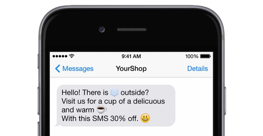
Emails are not just the only way to deliver your message to customers. You must have an alternative method, such as text messages or push notifications, anything that would compel your customers to open your site or app. However, be short and simple in your approach. Use an emoji with a short message clearly stating the offer and deadline.
Note that 47% of consumers expect a web page to load in less than 2 seconds. 40% of people abandon websites that take over 3 seconds to load. Therefore, speed is everything here. If an eCommerce site makes $100,000 per day, one-second page delay could cost $2.5 million loss of sale every year.
#5: Stay on top of the Mind with Social Media Remarketing

Social media campaigns are the cost-effective way to reach your customers on various platforms. Make a catalogue, display your products, ensure small texts describing the products are added, and you are good to go. A product feed can help with the display of products dynamically. You can set up product feed using Plugins if you use eCommerce platforms like Shopify.
With 2018 came new ways to explore website designing. Thanks to responsive design, the scope of designers has shifted from 800 x 600 pixel screens to anything from mobile devices to smart watches. And trust me, responsive design is here to stay as screens and devices evolve constantly.
Keeping pace with the changes, websites too are transforming rapidly, catering to varying user needs and interests. Whatever it may, here are the top 7 responsive web design trends that you should consider to offer an enhanced user experience.

Be Illustrative
Accept it or not, website users are a bit bored of stock imagery and stereotypes by now. Most websites look somewhat similar, and that is the biggest turn-off for the users. A great way to get rid of the monotony is to be more illustrative when designing your responsive website. To create modern design with responsiveness, use visual illustrations that connect to the users at human level.
Illustrations have the ability to make the website design eye-catchy and narrate the story in a visually pleasing manner. Top brands such as Google Doodle and Dropbox use playful, lively illustrations in their web design to grab user attention, and create a strong visual identity. It is best used to simplify complex ideas or showcase your brand strength. Here is an example of Google using captivating illustrations called Doodle:
Striking Typography
Typography plays a vital role in responsive website design. It has been there for years, but gained importance only recently with designers setting fine examples of using creative and bold typography to stand out across the screens. Irrespective of the device or screen size it is being viewed upon, typography gives your website a fresh and professional look. See the example below:
Use Vertical Menus for Better Viewability across Screen Sizes
On devices with smaller screen size, long-stretched horizontal menus may be difficult to navigate, and do not impress the eyes. Users do not like to pinch, zoom or scroll too much when using smaller devices such as Smartphones or tablets.
To deliver enhanced user experience, use a vertical layout that can fit a small screen size appropriately. This way the entire menu is made available to the users in a more readable manner. Creating drop-down menu in a vertical layout can enhance user navigation and experience significantly.
However, you do not have to worry about vertical layout making your page appear longer if you have few menu elements. In that case, a tabular layout works just fine.
Create Responsive Logos
As responsive website design gains importance like never before, brands should consider creating responsive logos that beautifully narrates their brand message across all devices and screen sizes. Here are some examples:
Use Fonts Responsively
This is one of the best responsive web design trends that will rule the years to come. It is all about resizing the pixels, percentages and rems in an optimum manner to make the same font appear equally visual across all devices. Resizing the font should be done effectively so that it does not affect the UX design.
Keep it Colorful and Bold
The attention span of a mobile website user is even less than 8 seconds. There must be something striking to catch their attention and engage them for long. Only easy navigation and bold typography won’t help unless you use colors intelligently for a responsive design.
Depending on the type of brand image, choose attractive color formations yet keeping it simple. Gradients add personality, and are one of the new techniques to keep your design fresh and corporate. Use bold duotones or keep the colors muted to create a more engaging experience.
Be Minimalist
The secret to responsive website design is to minimize clutter, enhance user experience, and simplify as much as you can. In a scenario where there are millions of similar websites vying for user engagement, only ‘simplicity’ will help you stand out. Right from the design to color formations to content to UI, be minimalist to make it more responsive for improved user experience across all devices.
In this constantly evolving web design scenario, responsive web design promises limitless creativity. Stay abreast with the latest trends that would bring a paradigm shift into the way we see website design in years to come.


