How to choose good color combinations for website
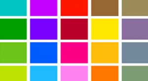
For a stable website design, color and theme of the webpage give the most important attribute to the maximum. Color is the central component of all the website design so that it is the best way of expressing the brand. Designers of the modern day are pushing the boundaries for expressing the coloring outside lines. Below are some of the colors or could be suitable for the colors for the website or application. Many numbers of designs are available with the trend predictions that could never fail the color.
In the olden days, most of the colorful expressions have been bound to the screen technologies that are displayed with the limited web colors for the web users. However with the advancement in the technology and innovation, there are many numbers of new screens are available that reproduce richer colors, saturation levels and vibrant shades for the website and mobile apps. Designers have used many numbers of strategies for the website designing that would also give the specific element for attaining more attention. To enhance the complete brand experience, it is better to upgrade to new tools and technology.
Creating Strong Background:
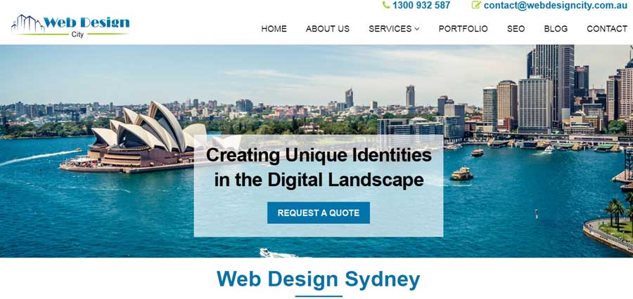
Since there is a tremendous growth in the technology designs, most people opt for the bold backgrounds that would give a neat look. For the best design, the powerful and colorful background is considered the best move for giving more interest to the specific section. Whatever you type of options, it is best to get the best opinion on better background that is acceptable on all the section to easily stand out.
Root Studio is one of the great examples as they have started the design with the yellow background that becomes the great highlight of the website. Yellow background also helps to easily set the tone for most of the case study and one of the greatest benefit is that the minimalist design style that is used with the background color for important element design. However, not all of the case studies have the vibrant colors such as Chester Zoo yellow that are highly suitable for vibrant hue for making something.
Mambo also uses the color as highlight difference in the section as the portfolio. It could also give you the best option for the deep blue, neon yellow or even black gives the more elegant look. Pairing the neon yellow with greens, skin tones and blues black also work better in harmony. In fact, the background colors also help to make the section more interesting and unique. Branding for agency becomes much easier.
Stylishly animated websites with web presentations for impressing the modern audience

Picking the right element combined with the other aspects becomes the most important aspects that are crafted carefully on different satisfying criteria that include the aesthetic, usability and function. When all other elements have worked together then with seamlessly enhances the impact on content.
Right Statement:
Color is used for making more statement bold. Using the Uber sign language on a landing page is considered as the best option for the orange gradient background that definitely catches more attention. Even though, it is considered as the best design strategy that mainly establishes purposes of the page that teaches the people with the basic sign language as it mainly relies on the visual cues.
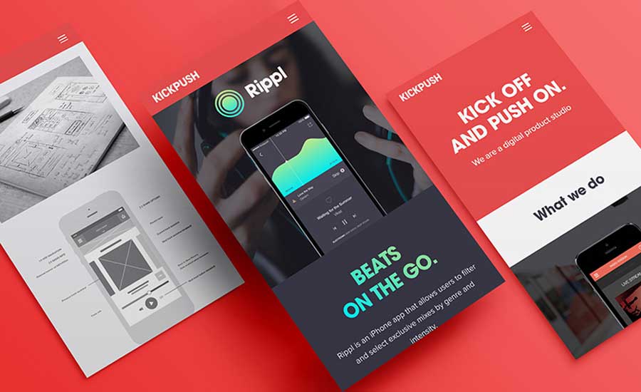
Kickpush design studio portfolio becomes the most amazing design that inspired most of the people across the world within a glance. Everyone has a different kind of personality and Kickpush likes to enable that it is different from the chosen color scheme. Having these best design that would give the complete visual statement is the best option.
Better Story For Branding:

Color and the innovative theme are considered as the best asset that helps to tell the right story in the more imaginative way. One of the best examples of importance Color for the homepage is the Bloom. With using the high extensive same almost-electric blue design along with other visual elements, the story gives quite an imaginative feel. Using the visual design, the blue helps the user to scroll from the header to footer by giving them more efficient look. When you have different sections, there also different color available with the flow that also becomes more efficient storytelling aspects.
Adobe’s Marketing Cloud landing page is one of the best massive pages that have the large sections in it. In fact, each of the section has their own color scheme that brings you the more efficient option for easily enabling the highest standard. Colors could differ from the light blue at the top along with the fire engine in the red to the dark purple establishes the modern look in a unique manner. Photography with the new trend also goes on each color to the extent. Color also easily tells the story of each of the section that is also enabled with the landing page.
Creating Excellent Interest With Adding Personality:

Color is used for adding the interest to the design. Normally, bold and large colors do not always work on the front and center for the designs that the colors are used. When making landing page quite pleasant that looks more option for the engaging more audience, it is easier to make without the use of a bright red background.
Improve Branding Performance:
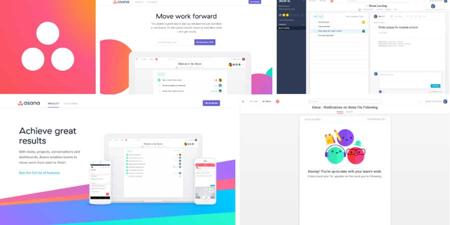
Most of the viewers like to view only the color for branding which is highly suitable for increasing the performance of the landing page or website. In fact, many people could have followed the Asana’s redesign in which the colors are implemented based on different aspects with the color gradients that acts as the part of new identity. Colors are heavily used in some sections or part of the website but not in all the parts. Colors are different and vibrant. Normally, colors work well together as the Asana’s newest branding becomes colorful and vibrant. The color strategy is considered the brand positioning of Asana and it is bright pink, purple, and orange. Gradients of the neighboring colors such as blue and green are also used in the process that is considered as the superior option for the designs. Stripe colors also become the biggest trendsetter when using the colors and it gives more choice for easily impactful on branding.
Using the strategic color on websites gives you the better option for creating the best brand such as Asana and many others for making the bold statement with the best bright red background and it also makes sure that the viewers have the different perspective view. Color helps to bring the personality along with easily the brand’s identity to great extent. With using the appropriate color on web design gives extensive stronger and better attributes.


