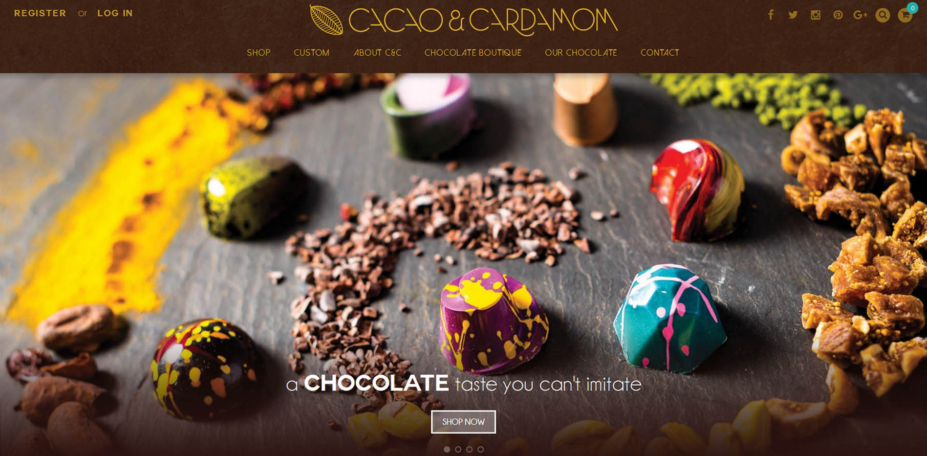
Factors that make a website design stand out
Millions of websites have almost crowded the web world these days and no matter what business you are in, you will have thousands of competitors promoting the same product. Being on internet is the best thing that you can do for your business with more people visiting websites for contact, product description or reference. In such a scenario it is important to have a website that is different from other websites in the industry and that can be made possible by a good website designer. While there are several factors responsible for making a website look good, there are some factors that make it stand out and webdesigncity.com.au knows how to use them.

• Minimal loading time: Nobody has time to spare these days and having a website that takes less time to load is a boon. This assures that the viewer will not go out of it without looking at the product. Flash player may sound lucrative but it is not going to make things faster. Software that doesn’t load on most systems is a strict no for the website. You will lose out of customers.
• Colour Scheme: The colours you choose for your website along with the theme have a lot to say about your company and the product. While some colours may look vibrant, they may not do justice to the taste of the target group of customers. If you are running a NGO or professional website for pet adoption you cannot have a theme that is vibrant and colourful. Similarly, if you are selling baby products, black or simple white is not the colour to go with. Web Design City dealing in Website Design Sydney has great sense of the same.
• Navigation: The first page of the website or the home page has a lot to do with the performance of the website. The viewer shall be able to find the places to go and the navigation shall be easy to follow. All important buttons should be highlighted and shall be placed where it is easy to locate. This makes it easy to navigate and find the actual product.
• Purpose should be clear: You need to know what your users want. If your users are looking for information, the website can be as informative as possible. Keep the language simple and at the same time, SEO friendly. The pages shall have the clear perspective and should be designed accordingly by the website designer.
• Follow F Pattern: Most of the successful website follows F pattern which says people notice the words written in the left more than the words written in the right. So the important information and the buttons shall be either on the left or middle or top of the website as that would be noticed. Keep the right side for advertisement or not so important stuffs.

You can eventually think of many more factors to make the website design Sydney stand out but these are the most important of them all.

