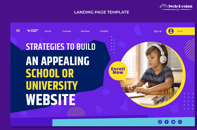
Strategies to Build an Appealing School or University Website

How to Design and Build a School or University Website. Online university marketing offers more than a good or service to potential students. You’re marketing an encounter that generally lasts four to eight years. Because of this, the foundation of your digital marketing must be a unique experience, beginning with site design. If visitors to your website have a negative experience, they’ll assume that your campus will be no different.
You need a well-designed academic website to market your institution efficiently. Read on to learn about the best strategies to build a great school or university website with the help of a website development service.
Brand your website
When it comes to academic website design, branding is the first thing to do right. Your website shouldn’t feel impersonal or uninteresting. You must invoke your school’s distinctive branding components if you want students to enrol there.
Use a design that expresses that feeling, such as serif fonts, beautiful designs, etc., if your university strongly emphasises its history and legacy. Meanwhile, strive for a cleaner look if you want to appear young and contemporary.
Additionally, be sure to include the colours of your institution on the website. Don’t design your website red and white if your company’s colours are orange and blue.
Add Photos and Videos to Your Website
Using photographs and videos to create a positive first impression of your facility. Create a fantastic photograph by carefully adjusting the lighting and angles. Another excellent suggestion is hiring a drone operator to create amazing footage of your building’s inside and outside. A photo gallery is crucial for viewing historical events and for reliving nostalgic moments from the past. Choose a professional website development Sydney service provider who can help you personalise the website.
Introduce Your Teachers
Without its instructors, whose labour cultivates the school’s reputation and community, a school wouldn’t exist. Using this in mind, introduce your professors in 1-2 phrases with images or short videos highlighting their experience and area of speciality. By doing this, you may begin to earn the trust of the prospective student’s parents.
Group navigation by type
There may be a lot of content on website design for school, and not all of it is easy to find your way around. While specific sites are easier to find and read through discovery, others benefit more from one-click access. The majority of university websites use one of three primary navigational styles:
Content-based navigation
These are your standard About, Admissions, Academics, etc. sections with pages arranged beneath them that are easy to find and consume. They need to be visible using the typical top navigation menu.
Audience-based navigation
There are several clearly defined audiences for university websites, and these visitors come for particular purposes. This includes students, alumni, instructors, staff, and other possible audiences. To make it easier for these audiences to discover the material pertinent to them, one navigation method is to provide them with user-specific navigation.
Utility-based navigation
Do you recall the days when visiting your university’s website was just for accessing “Blackboard”? To provide users with one-click access, these tools they now desire and require should be removed from the top-level navigation and organised in a utility nav. That includes resources like Blackboard, the Registrar, and the Academic Calendar.
Mobile Responsiveness
Mobile phones are the most widely used and practical instruments when consumers need to find information. Statistics show that there are now more than 3 billion smartphone users worldwide. Students today are essentially addicted to their mobile devices.
Due to this, every educational institution should emphasise creating a website that works well on various mobile devices. With a mobile-friendly website, ranking higher on search engines and increasing excellent enrolment rates is simpler.
Valuable Content
It is essential to ensure that a university’s website offers relevant and helpful material. It distinguishes a website and boosts visitors. The user satisfaction rates, i.e., the contentment of your students, are also raised by valuable and high-quality material. You are likely to choose a website with high-quality material if you are seeking an online conversion tool.
Even while producing such material takes effort, it is an affordable way to increase conversions. Institutions can, in any case, employ qualified content producers to deliver dependable and user-driven content.
Build Information Hierarchies
With such enormous amounts of data, it is crucial to arrange it more effectively than anyplace else. The university website design that makes it easy to get information that is organised nicely is the finest. It is conceivable that the educational institution can make it for the entire educational process if it can make it for its website.
Ensure that the homepage has links to all of the crucial sections. Although it may seem simple, gathering information for a college or university is difficult. Avoiding overloading is crucial, but you must also provide potential clients with all they require.
At Web Design City, they can build an excellent website design for school or university. Their extensive experience has enabled them to work with top schools, universities, and organisations. If you want to hire the best website designing professionals, get in touch with this team.


